Using the most recent data from the research your team has gathered, create an infographic that visually demonstrates the NEED for your Quest project. Teams will need to demonstrate their ability to create an original chart and/or graph using data from research and digital media. Additionally, teams will need to demonstrate a thorough understanding of the research they have conducted and, while properly citing their source, use their data to create something original.
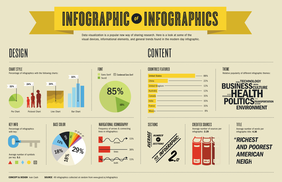
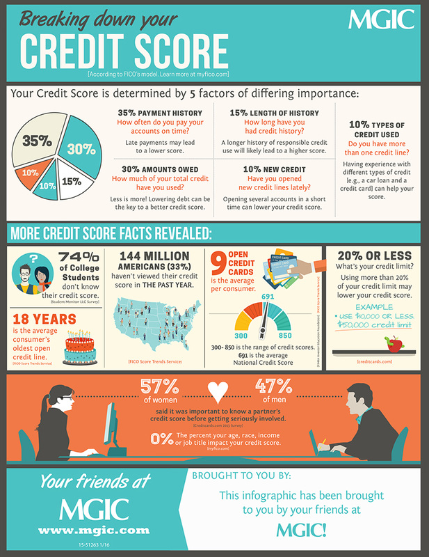
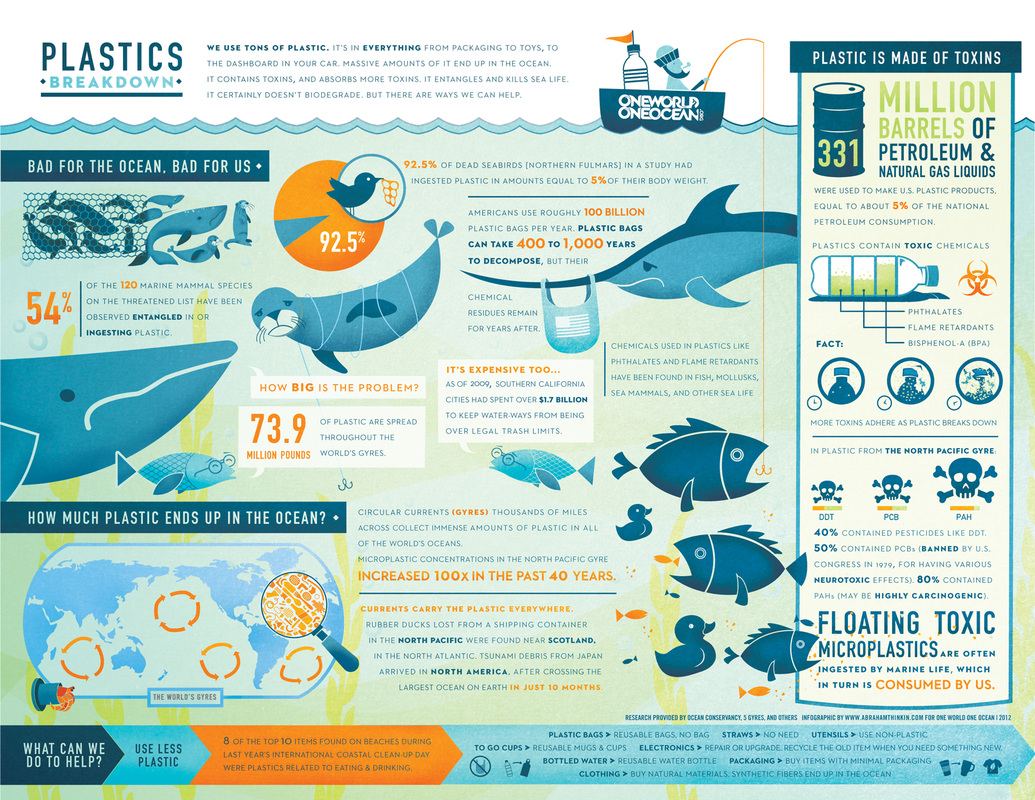
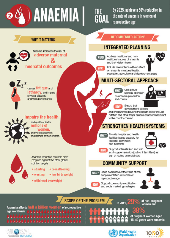
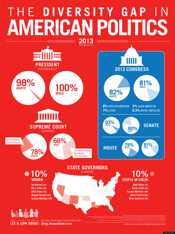
It is important to understand your data in order to select the most appropriate display (graph, chart, etc.) of the information your data relays. For example, if your team has compelling data that shows change over time, a line chart would be appropriate to use. On the other hand, if the data is a percentage, a pie chart would be more appropriate to use.
For resources on how to create an infographic, visit Creative Bloq's webpage by clicking HERE.
To meet the Infographic objective, your team will need to design an original infographic that contains at least one student-created graph or chart, identifies the need for the Quest project, and brings awareness. Have your Quest coach sign off your team's progress on the Quest Objective Completion Form.